Tiny Tots Town
Case Study
Parents experience mix of emotions while their kids are at day care and there is a sense of longing. It’s important for the parents to know what their kids are doing in the daycare and that they are safe and sound. To help overcome this worry, Tiny Tots Town offers a helping hand to enhance parent’s experience.
My Role: UX Design , UI Design
Tools: Figma, Miro
Duration: December-April 2024
Problem
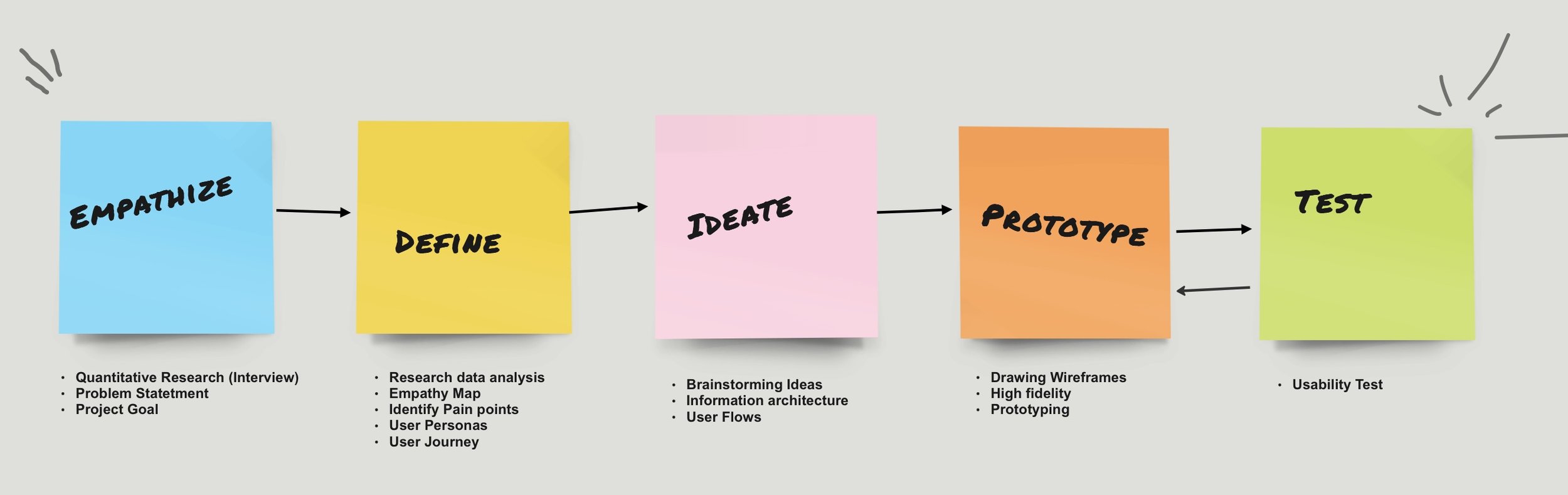
Design Process
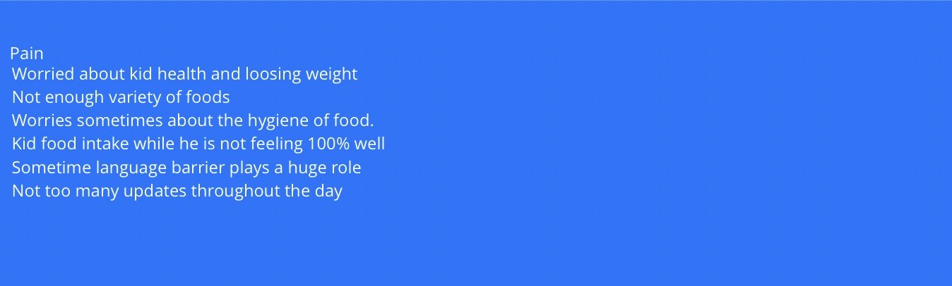
When parents drop their kids for daycare, they go through a lot of emotions throughout the day, especially being anxious about their kids' overall well-being. At times there is communication gap between parents and the daycare staff. Lack of information and support regarding the educational goals and insights into their child's learning progress and milestones. Inconsistent updates on the daily meals of the kids at daycare is another point of concerned for the parents. I would like to explore how to make the daycare experience better for kids as well as parents.
User Research
- The user research was driven by the needs, preferences, and challenges of the target audience.
- Research plan was curated based on the insights into user demographics, behaviors, and preferences.
- A significant focus was placed on recognizing the varied needs of users, ensuring user satisfaction.
- User personas were created based on refined insights into data gathered during multiple user interviews.
Product User
Apps users are Parents (Men & Women) whose kids are going to daycare or parents are planning to send their kids to Daycare.
How Might WE…..?
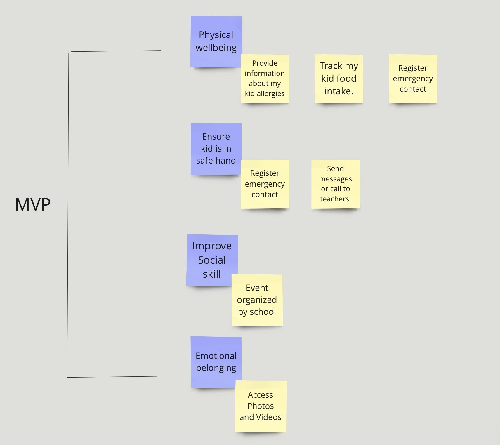
At this point we have gathered good amount of data to state the problems and areas of the improvement that parents faces. Parents want to focus on all the aspects of kids well-being (Physical, Social and Emotional) and would love to get any actionable feedback through the app or through interaction with teachers.
Based on this here are our how might we items:
1.How might we quantify the progress of a child like quantifying weight gain/loss month over month and learning progress?
2.How might we make the communication direct and seamless between parents and the daycare teacher?
3.How might we make the interaction between the parents whose kids are in the same class seamless?
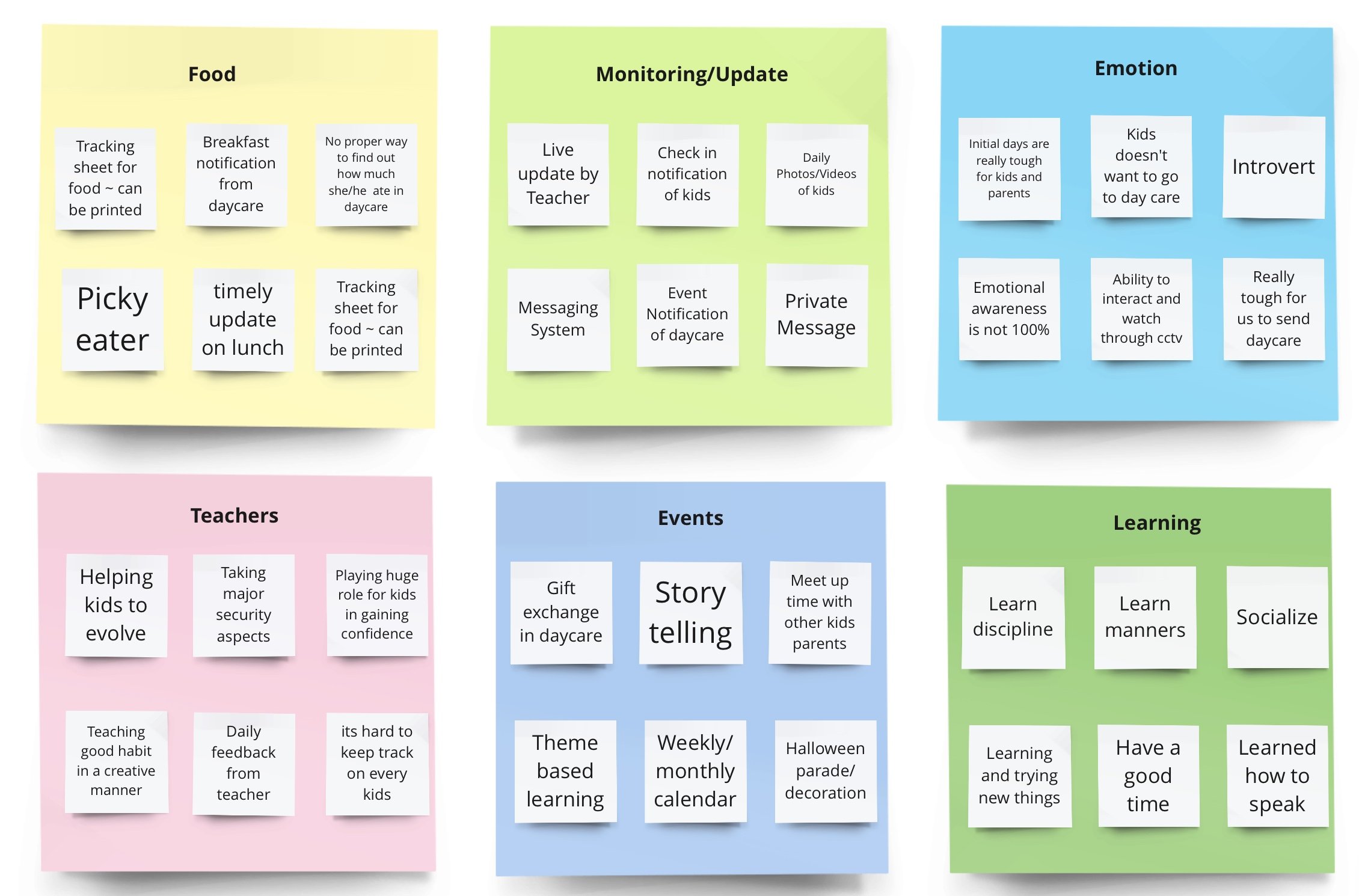
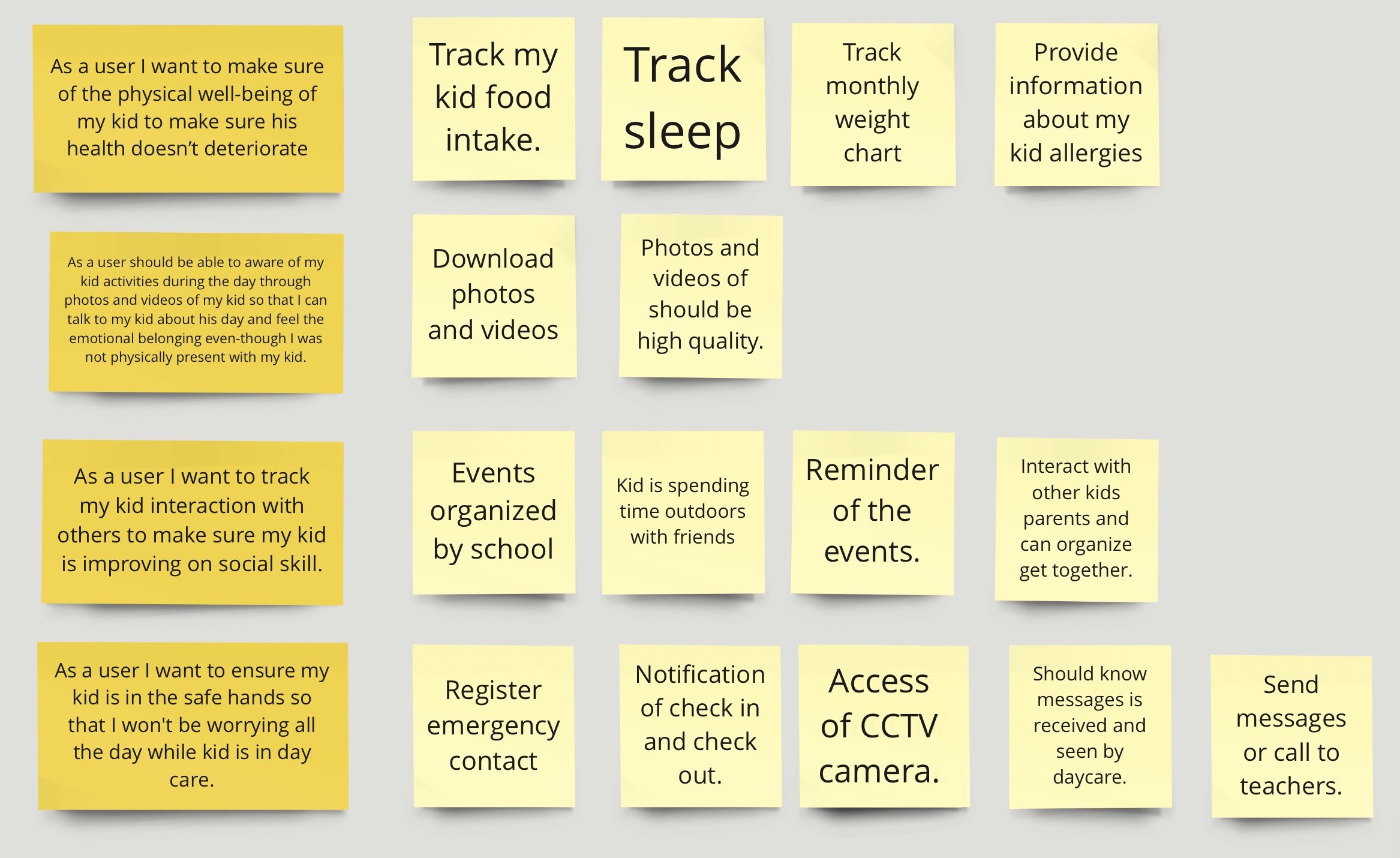
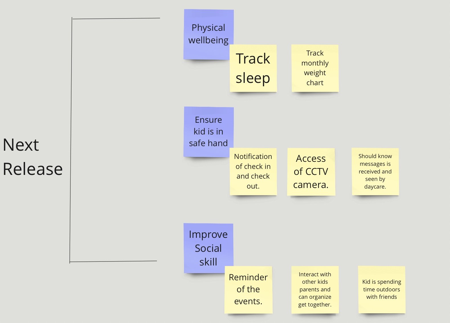
Affinity Map
As I started interviewing the participant, there were instances where parents did talk about kid being picky eater, feeding the kid breakfast at home and reaching out to day care if parents are running late. The more we interview participants, there is a clear theme and it became very clear that parent’s utmost priority is physical safety and health of the kid. Keeping in mind that theme, I did categorized it into 3 main categories, Food (proper meal during the day), Monitoring (update/reach to teachers in case of any issue) and finally emotional well being of the kid.
After that there is another set of items where parents care deeply and these includes Teacher interaction (with Kid as well as parents), upcoming events so that they can prepare for the event and make their kid feel special and there is a strong desire to also track kids learning and how is he progressing in his learning milestones.
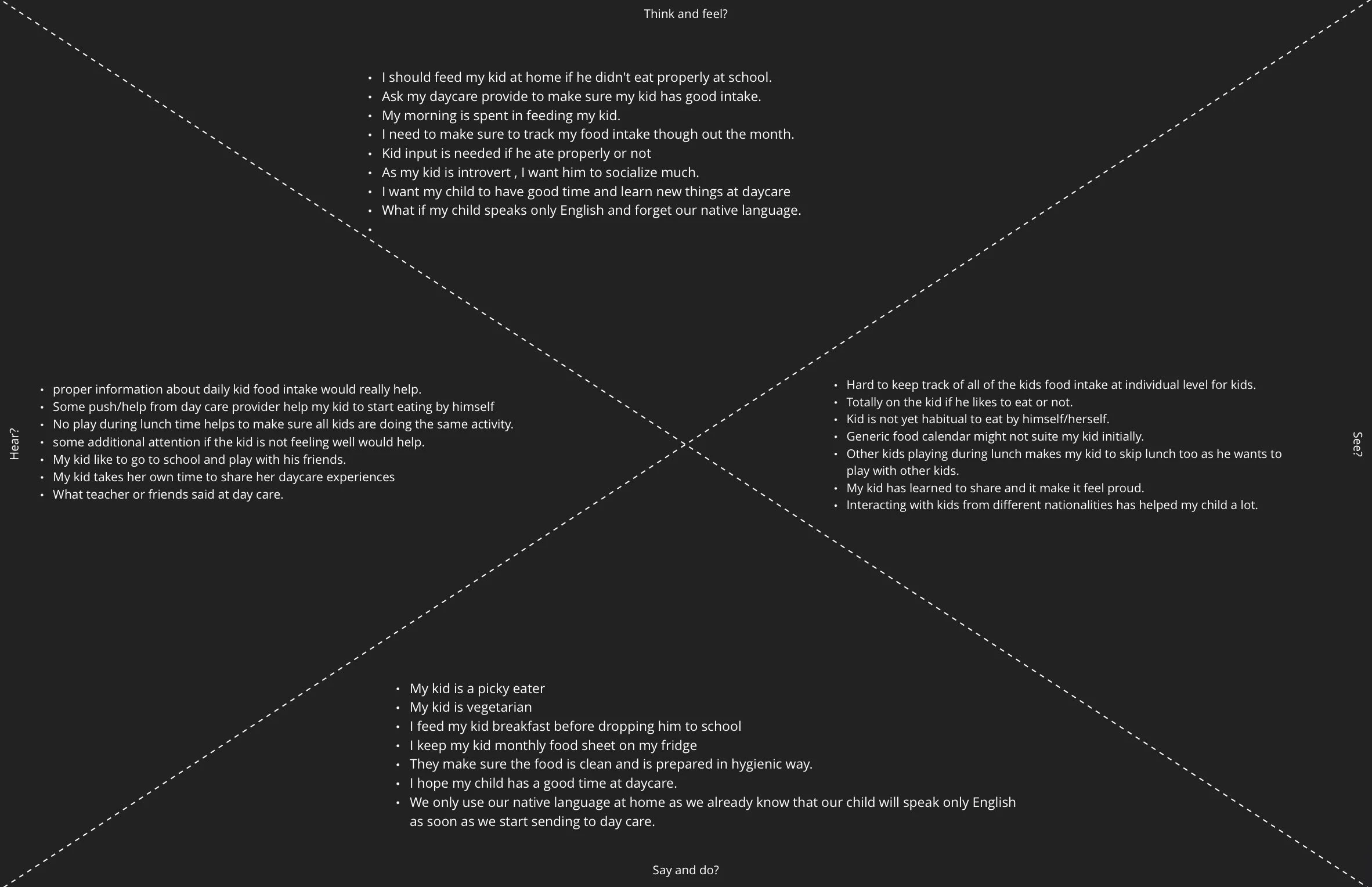
Empathy Mapping
Parents want to make sure their kid has proper diet during the day and to do that they try multiple avenues like talking to kid, talking to teacher, looking at the tiffin box if meal is sent from home. They go through all these ways to find the kid’s food intake during the day. Parents would love if they can get proper update about the kids food intake as this will really help them make kid evening meal plan.
Parents also want to make sure their kid is not feeling sad and able to interact with teachers and other class mates. To find more on this, parents again interact with kids and teachers to get information on the same.
A more frequent update of pictures and videos along with any pointer from teachers will help parents and provide them sigh of relief about the kids emotional well-being.

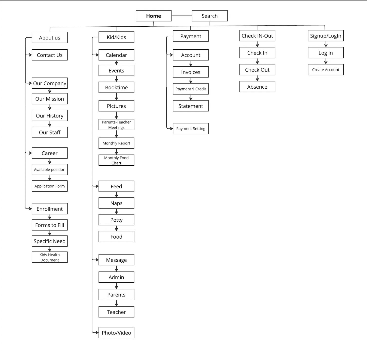
Site Map
While creating sitemap for the daycare app, I have kept in mind the below points:
Clear Navigation: Quickly find specific sections or pages without navigating through the entire site.
Quick Task Completion: Sitemap is created in mind for user to accomplish a specific task by navigation to specific section of the sitemap.Taking an example of Check-In and Check-Out scenario or Payment scenarios where user want to accomplish those specific tasks and parents can easily complete those tasks by navigation to those sections.
Faster Discovery: Parents can locate content more quickly, reducing the time spent searching and increasing overall satisfaction.
After creating sitemap and routs, I chose three critical scenario and create flowcharts for their actions while trying to accomplish tasks.
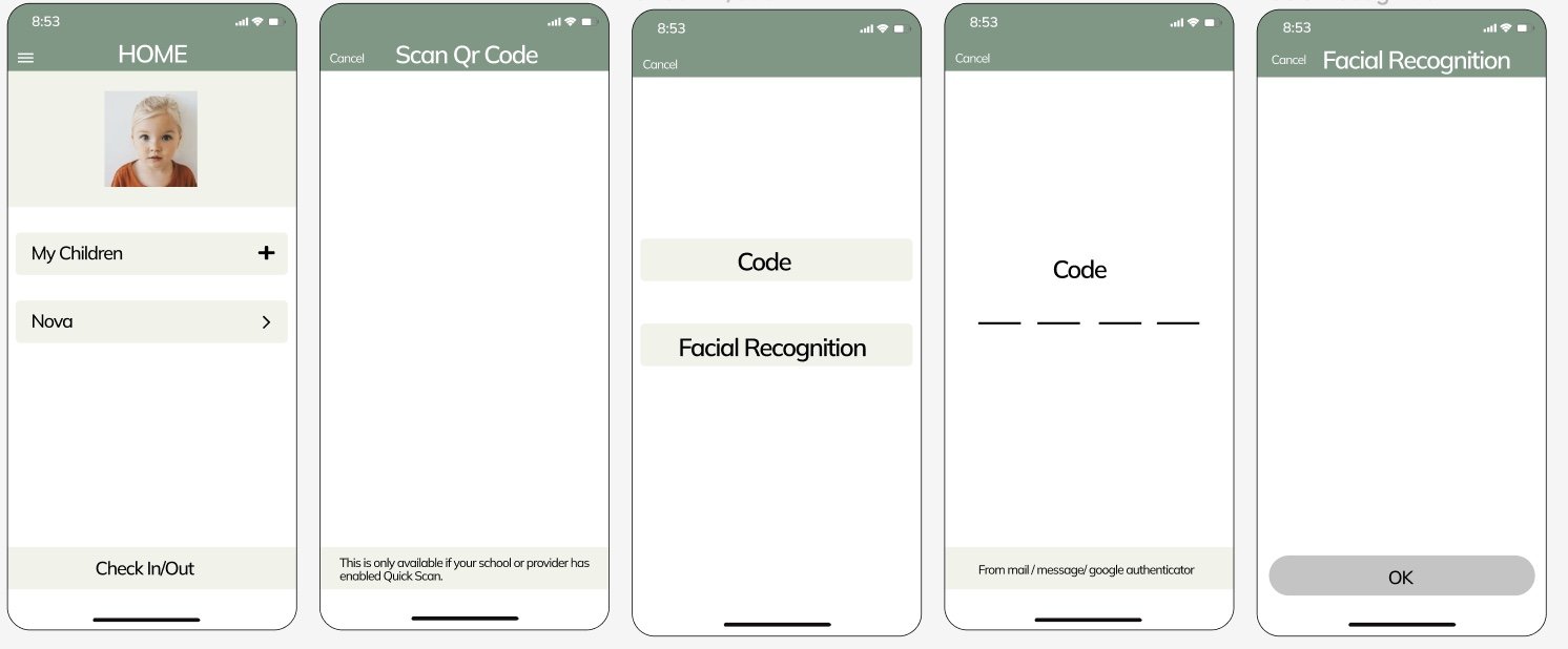
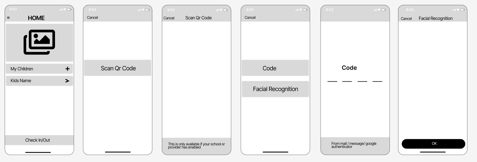
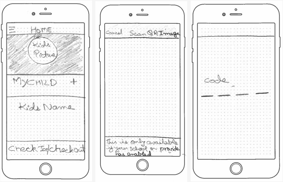
The First flow describes the Check-In/Out flow during the kid drop and pickup time. The flow keep in mind that only the parent should be able to check-in/out the kid by providing the ability to send the code or the ability for face recognition and without that no-one should be able to pick the kid.
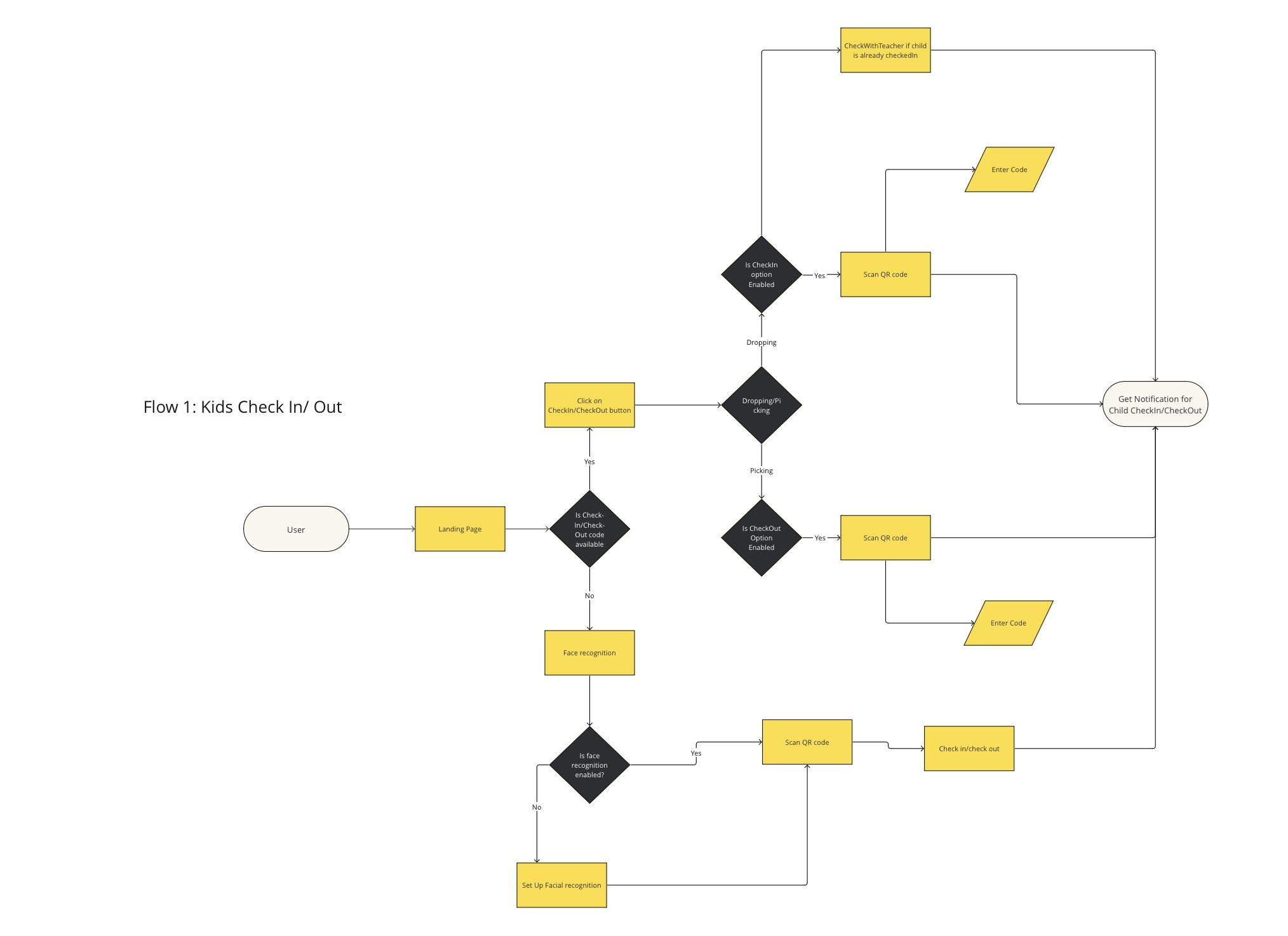
User Flows
User Stories
Test Result
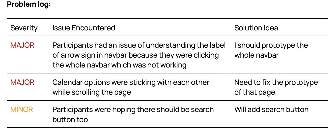
The Usability tests identified issues with “arrow sign” title at the home page, cannot recognize the download button, check-in/check-out flow was not visible , confusion finding where user will get the code while trying to check-in the kid, Facial recognition for safety features is a little confusing, All Activity navigation bar problems.
Final Design Adjustment
Participants had an issue of understanding the label of arrow sign in navigation bar because they were clicking the whole navigation bar which was not working
Calendar options were sticking with each other while scrolling the page.
Participants were hoping there should be search button too

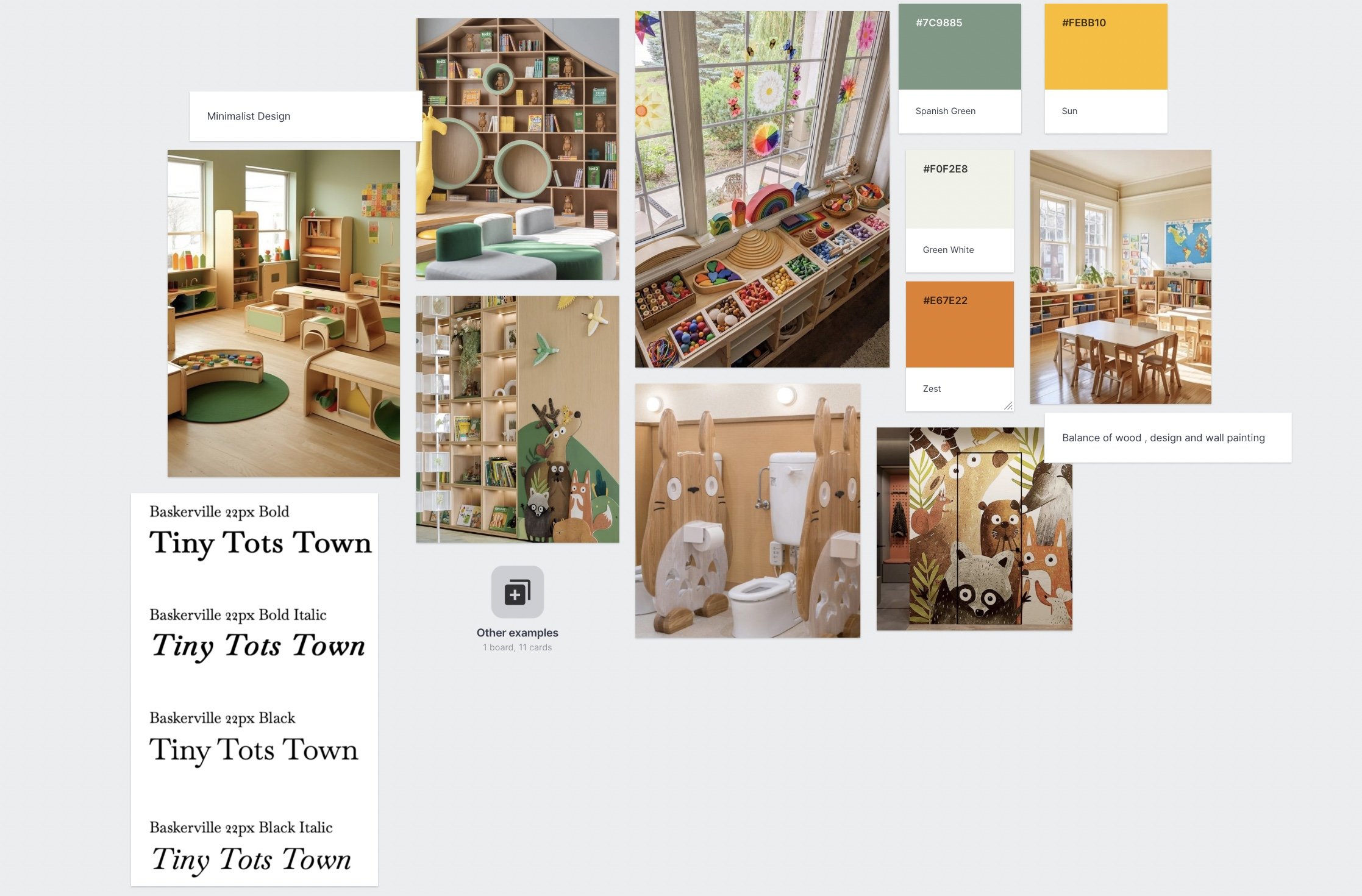
Mood Board
Style Guide
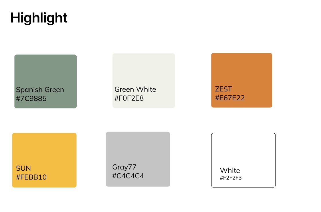
Color Style
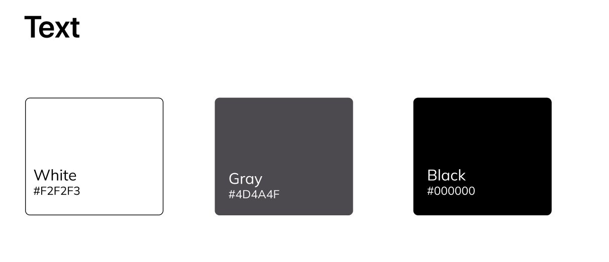
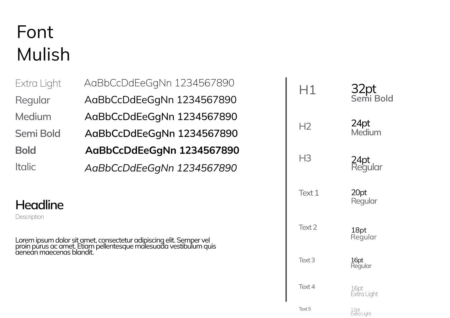
Font Style
Added search button
The click will work on All Activity navbar
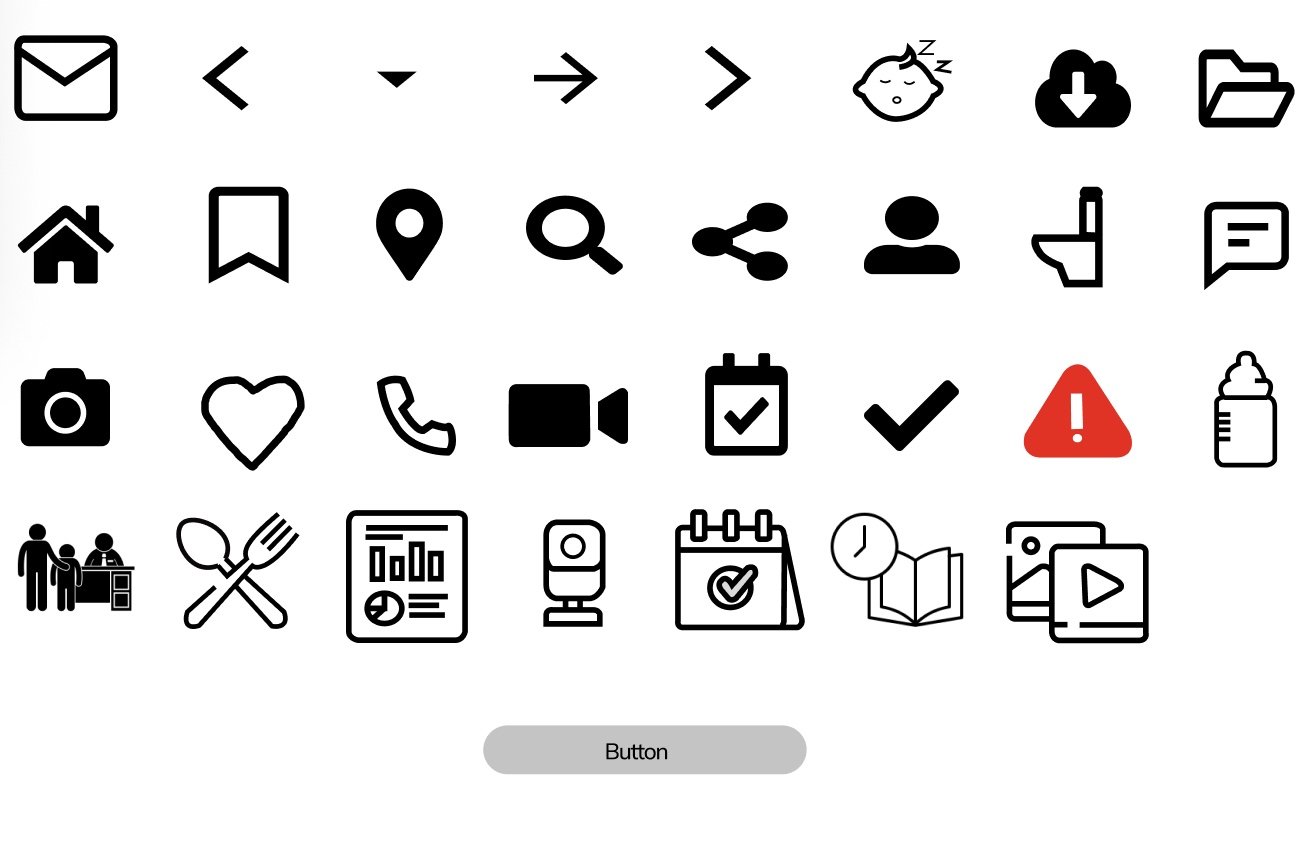
UI Elements
From the initial ideation phase to the final design tweaks, my methodology has consistently revolved around prioritizing the user, resulting in designs that truly resonate. I swiftly integrate gathered feedback, placing user experience at the forefront of my process.
Through a deep comprehension of user pain points and the implementation of validated solutions via feedback loops, my designs strive to enhance the experience for all stakeholders—parents, teachers alike.
Conclusion
Link to User Stories
https://miro.com/app/board/uXjVN1dHK-Y=/?share_link_id=625593577837
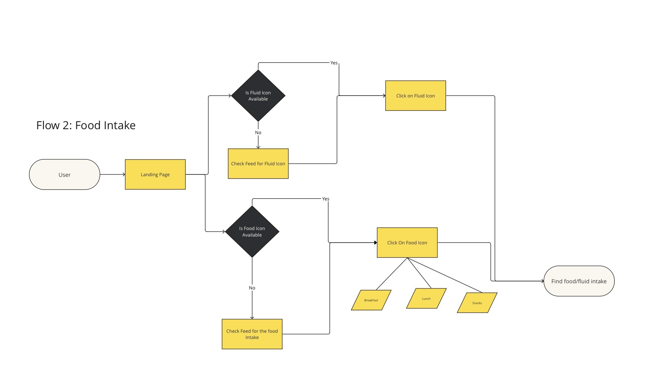
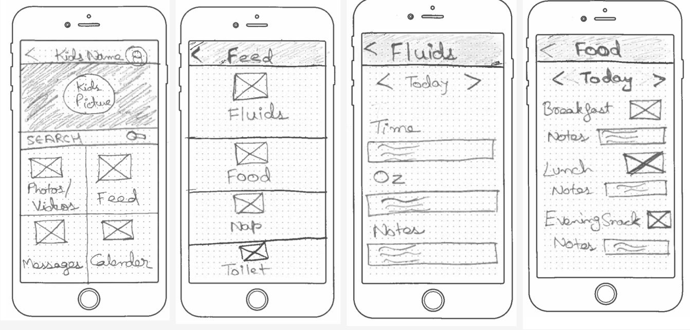
The Second flow describes the flow parents have the ability to track the kids food intake during the day and making sure their kid have proper meal while the kid is at the day care.
After creating the user flow I quickly went to rough sketch those flow and created the sketch for all 3 user flows which includes Check-In/Out scenario, tracking food intake and the scenario of tracking events for the upcoming events in daycare.
Hi-Fidelity Design
After wire-frames, it’s time to start presenting it to user to keep the feedback loop rolling. During my entire design I have always kept 2 aspects in my mind:
Quick and clear actions to complete the required task, keeping safety in mind.
Every task is clearly distinguishable.
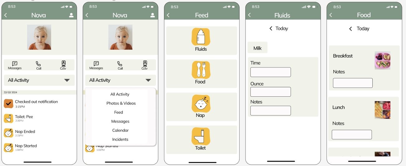
In the first flow where the parent is dropping and picking up the kid, parents can quickly Check-In/Check-Out kid while making sure the flow is highly secure so that nobody else can access the same.
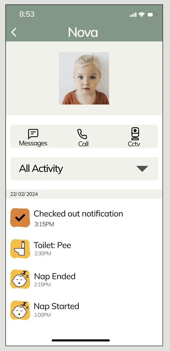
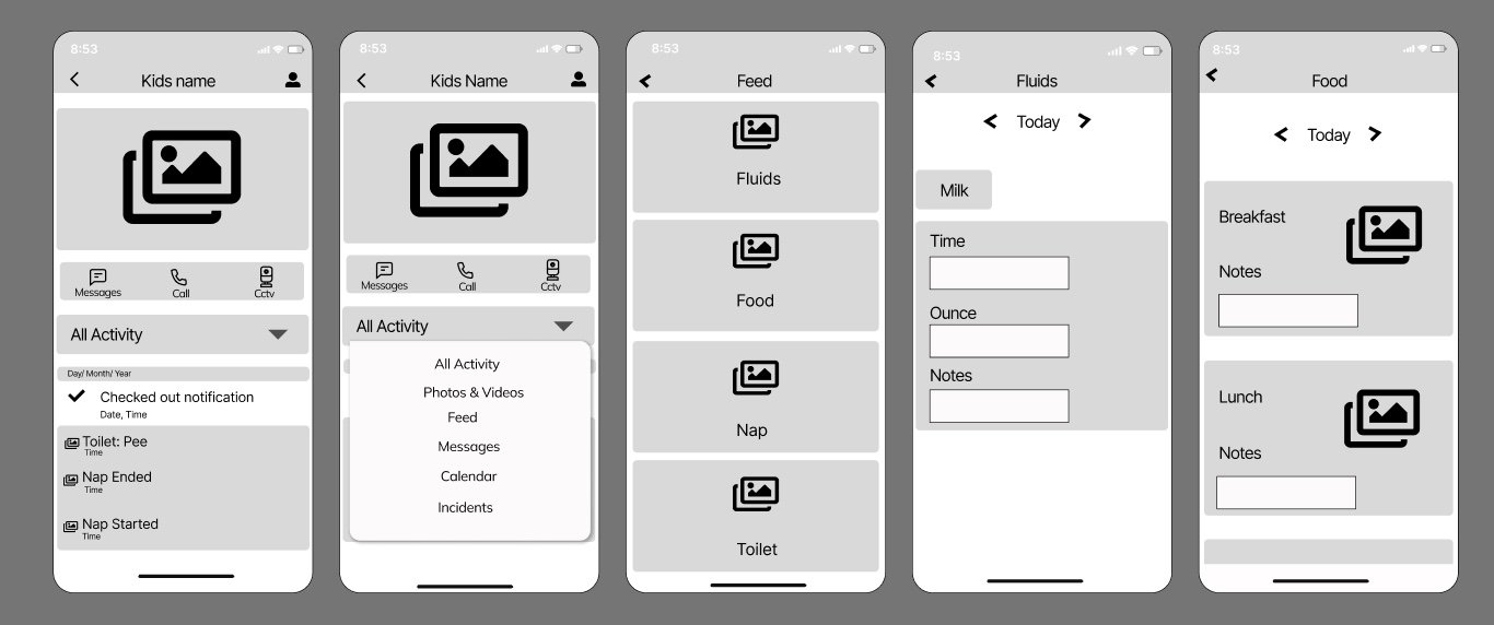
In the second flow, parents have the option to filter the activity and used the icons to clearly represent the activity. Presenting them with detailed information about the activity, in this scenario food intake.
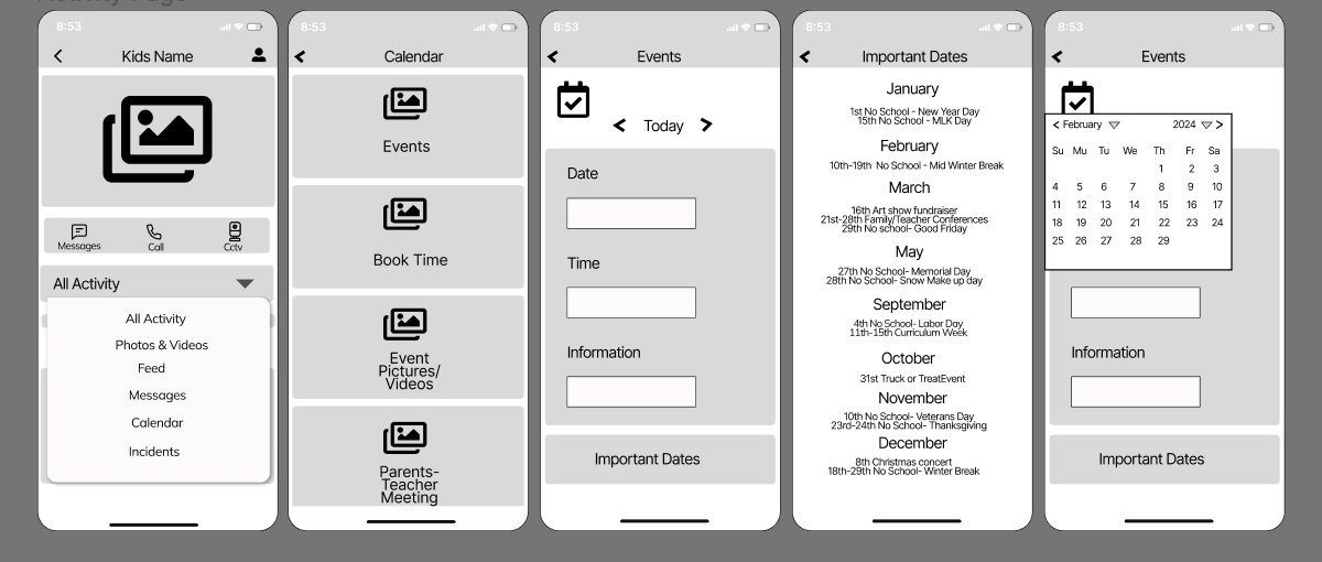
In the third flow, I have tried to highlight the important upcoming dates so that they can prepare according and make their kids experience amazing during the event.

Usability Testing
There were Three participants who performed the usability test and their feedback were noted.
Usability Test Script
In the Third flow I did try to describes the flow where parents have the ability to track the list of events in the kids daycare along with searching for any of the upcoming events. This flow also describes the flow where parents have the ability to add the important events into their calendar so that they can just track their calendar for upcoming events.

Link to User Flows
https://miro.com/app/board/uXjVNzJM3WE=/?share_link_id=483472147023
Wireframes
Sketches
After putting the three critical scenarios in hand made rough sketch, I want to quickly create the Wireframe as that helps visualizing and refining the user interface, ensuring clarity and usability throughout the design process. Below are the wire frame of the three flows.
Scenario 1. When parents has to Check in or Check out.
Scenario 2. When parents wants to track his/her Kids Food intake
Scenario 3. When parents wants to track events.
Scenario 1. When parents has to Check in or Check out.
Scenario 2. When parents wants to track his/her Kids Food intake
Scenario 3. When parents wants to track events.

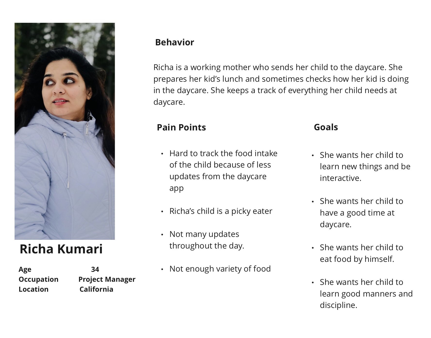
User Persona
Richa is a working mother who would like to interact with her kid and find about her kid day at daycare.At the same, there might be scenarios where she might miss the information which is crucial as kid can forget the information or didn’t convey at all. She would love if the day care app helps her with most of the information so that she doesn’t have to worry about any missing information and also enrich the interaction with the kid’s experience at day care.